This week, a lot of news has been released about changes in the design of all three applications at some level. Facebook is testing the new look it first announced at last year’s F8 conference. WhatsApp plans to introduce a dark mode for the Android version of their app. And Instagram has decided to remove the IGTV button from the main screen.
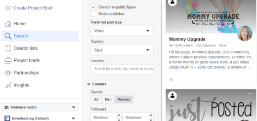
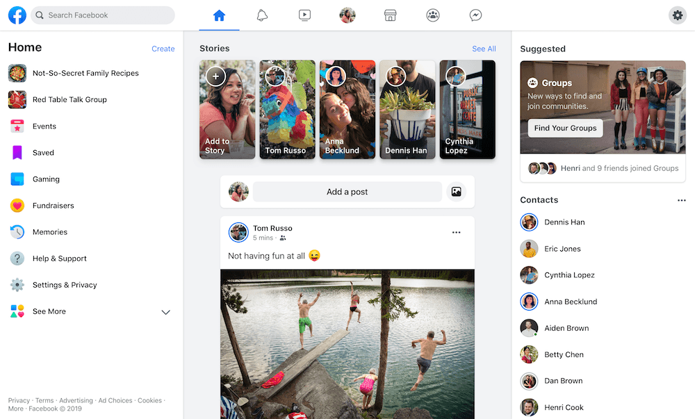
New Facebook desktop design
So far, the new desktop interface has made Facebook accessible to only a small group of users who are part of the test sample. Now, it plans to introduce it nationwide in the spring of this year.
For select accounts, Facebook will display a window asking if they want to participate in testing. During the trial period, users can switch between old and new modes and send feedback to Facebook, if they encounter errors. The new look of Facebook has a more airy design, brighter colors and a less-crowded background.
Dark WhatsApp mode
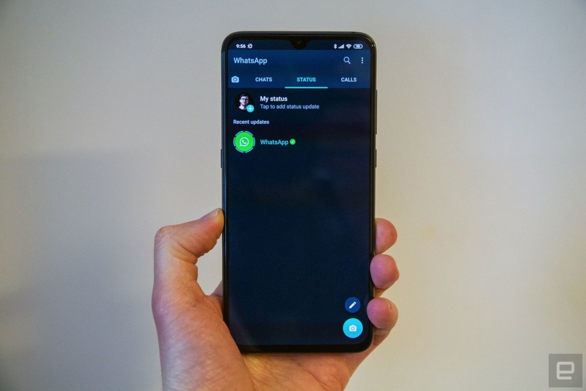
Facebook is also testing a dark environment on WhatsApp, specifically in the beta version for Android. Dark mode has many supporters, but also opponents.
What is a dark background good for? It reduces eye strain, conserves phone battery, and a darker screen adapts better to light and dark. If you haven’t used the so-called dark mode yet, we recommend trying it.
IGTV button removed from the feed
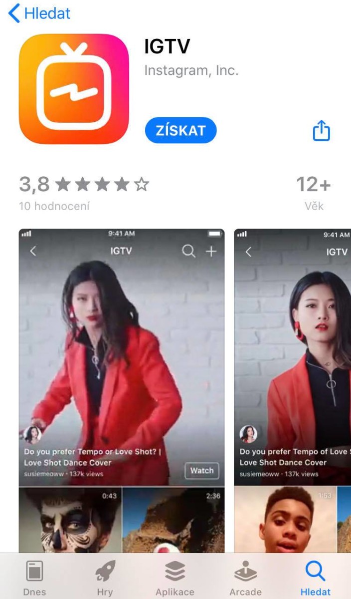
Instagram decided to remove the IGTV button from the upper right corner. Only a very small number of users have used the icon. According to internal data, users prefer viewing videos in the main feed, from searches, or in the IGTV app.
.


