It looks that Facebook keeps updating its apps in order to be more engaging and people will spend more time using them. This time is the turn of the Facebook and Instagram apps to get an overhaul.
In its effort to make News Feed more legible, easier to navigate and keep up with comments Facebook has introduced new, clear design.
Improving conversations
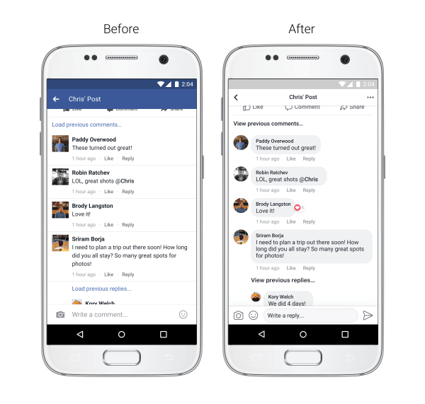
Facebook is a place where users express themselves and they do so through posts and by commenting on them. The update makes it easier for the users to keep up with threads and see which comments are direct replies to another person.
Improving legibility
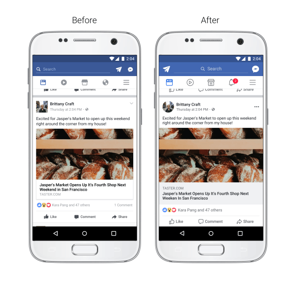
Facebook plans to make posts more readable so the redesign will include:
- Increased colour contrast so that typography is more legible
- Larger link previews so everything is easier to read
- Updated icons and Like, Comment, and Share buttons that are larger and easier to tap
- Circular profile pictures to show who’s posting or commenting
Improving navigation

In order to help the user navigate News Feed the redesign will focus on:
- Clear link previous
- Clear threading making it clear which comment you are replying too
- Clear exit. A back button that will take you back on News Feed upon finishing reading a threaded comment.
As for Instagram, the new redesign will be focusing on making conversations easier to participate by adding comment threads. Now, when you will be replying to a specific comment it will be more clear to see the comment you are replying to since it will be grouped underneath it.
Yes, these changes aren’t so “big” but adding them together you can see that Facebook wants to improve user experience and “make” us engage more with the app.
The above-mentioned changes will be part of the new update for both iOS and Android apps.


