You can find the brand new analytics tool, right in your Business Manager. It’s called Facebook Analytics and we tried what is available right now, and what features will like to see be available soon.
The analysis is the cognitive process made by the deconstruction of, even very complex, topics into smaller and therefore better understand areas. Through analysis, we want to get to know better the aspects of the examined object. We want to measure what is measurable, we want to find out everything possible. We want to know more because we want to make better decisions in the future.
Facebook in its relatively fresh tool for analysis, offers every month more and more options in order to analyse the behaviour of your customers. Compared to Google’s predecessor, Facebook Analytics offering of functions still looks quite poor. But, we believe that, in the following days, it will only get better.
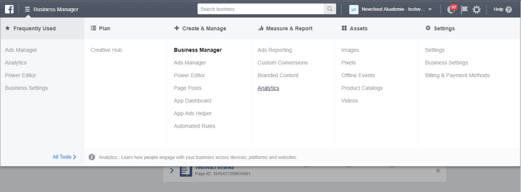
Where to find it
If you haven’t noticed yet, you will find Analytics in your Business Manager, not surprisingly, in the “Reports and Measurement” section.
The first step, before your analysis can even start, is to choose a particular “Event source”. Facebook Analytics works with more than one kind. You can generate reports and graphs about:
- App – of course, it is necessary to have already implement SDK correctly.
- Facebook page – some additional insights compared to regular Page insights.
- Offline event set – we described Offline conversions benefits in one of our recent articles.
- Facebook pixel – probably the most often and most typical event source and that’s why we will look at it in more detail.
Once you choose the event source of your interest, you will be taken to the basic overview screen with the classic layout, without any surprise.
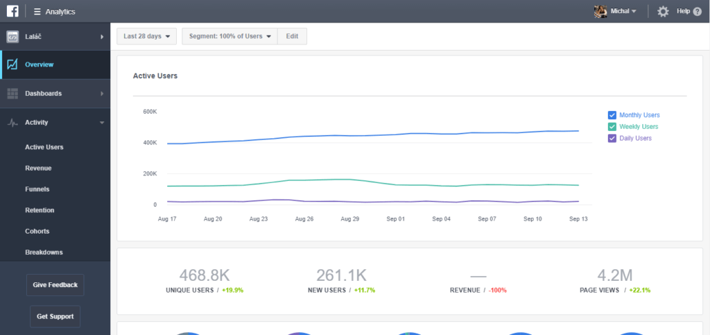
On the left-hand side, you will find a list of the tools grouped into categories. In the upper part, you can set the date range or play with the segment settings.
Working with segments
Probably one of the most crucial functions. Thanks to it, you are able to get some additional insights from all the reports described below. Anyway, as it’s been already mentioned at the very beginning of this article, deconstruction of the whole into the smaller parts – segments – is the cornerstone of every analysis.
Let say, that we want to compare a few subgroups of your web visitors – their behaviour or demographic information. If you operate in the e-commerce field, the segments of the biggest interest for you are probably:
- Those, who didn’t buy anything
- Those, who did buy something
- Those, who did buy something repeatedly or spend some significant amount of money.
For the creation of a segment, choose the desired event, in our case “purchase” and you further narrow the audience thanks to the event’s parameters; frequency and value.
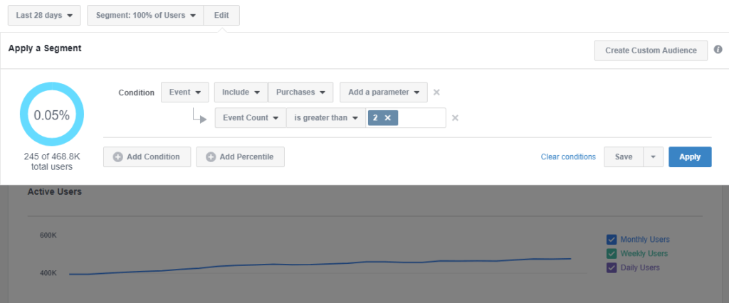
The really handy function is, that with only one click you can create an advanced custom audience for your campaigns. Once you have created all your desired segments, you can dive into the actual reports.
In this article, we will go through some useful and interesting, in our opinion, reports. You can find them all on the left-hand side menu, under category “Activity”.
Funnels
If you run an e-shop or you manage the campaign to support some, you will be for sure interested in your customers’ passage through the classic e-shop trio “View Content” – “Add To Cart” – “Purchase”.
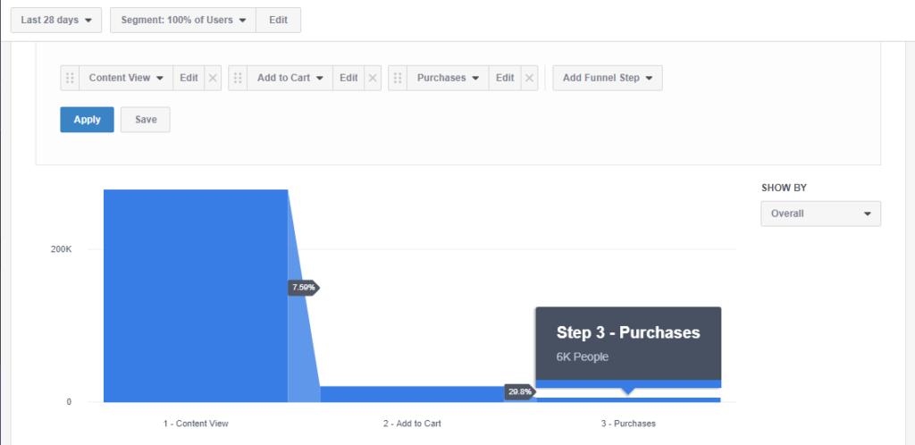
You can display any funnel you want, under one condition, you have first implemented a Facebook event for it. For example, you can visualize every step of a registration form and get to know the exact spot you are losing the users.
Cohorts
Beside Funnels, the Cohort report works only with pairs of events. Its informational value is in fact that Cohorts work also with the time aspect. Again, you can visualize basically anything, but if you have an e-commerce, the core of your interest lies in purchasing and adding products to carts.
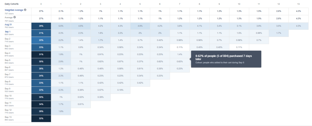
The vertical axis shows the date of the first event, the horizontal axis displays days following the original event. The darker the cell denotes, the percentage of people who performed the initial event, and also executed the second event on a particular day. For example, if you want to see the how to add to cart (event 1) and purchases (event 2) interact with factor day then the dark cell can be read as people who added to cart AND also bought on the same day (day 0) comprise the 26% for the 31st August.
You will appreciate this information especially when you are deciding about the length of the remarketing window for every particular event. On the example above, you can spot that the first column is much darker than the neighbouring one. This means that the majority of the buyers added the product the very same day, on which they viewed the page with product detail.
Percentiles
This report tells you how big is the upper fraction of users, which performed chosen action even during the chosen period with particular minimal frequency. It might sound complicated, but in reality, it is simple, really. Again, you choose the event of your interest, for example, the “Page View”, or the more interesting “Purchase”.
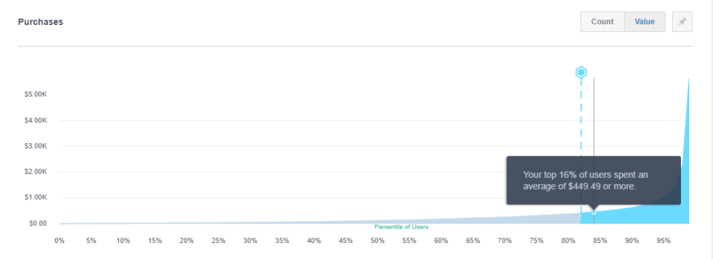
You move the line from left to the right, and by that, you change the size of the percentile, the exact value of frequency you can then read right from the floating chart legend.
From this report, you can gain a deeper insight into what is going on on your websites. Particular frequency values can reveal the exact state of things better than just the plain value of average.
Limits, options and what are we still missing
It is only logical, that you need the data set with some appropriate richness if you want to display something relevant in the graphs. For a small audience, you cannot expect much due to the limitations of a small-numbered audience. On the other side, if you dispose of with an efficient amount of data, Facebook Analytics reports will sample them by some sufficient rate.
To be honest, lots of information from analytics you could get also from other sources of Facebook advertising infrastructure. In Ads Manager, thanks to Custom Audiences and their Insights, etc., but it would cost you more effort. The added value of Facebook Analytics is simply the fact, that it aggregates all the information on the one place and visualise them in a simple and eye-catching way. It gives you the basic introspection, saves you some time, which you would spend with data processing. How you deal with the learnings from it is, again, only up to you.
All reports mentioned in this article and also others will be hopefully soon possible to arrange in custom dashboards. Dashboards are currently in the Beta mode and allow you to use only one basic type of graphs. And this makes the current version of dashboards quite uninteresting and de facto unusable. The relationship “client-agency” will be much happier, after Facebook push this issue little bit further and allows to use the full potential hidden in this tool.