PPC marketers now have at their disposal a free reporting tool by Google to help them create beautiful reports with ease; Google Data Studio.
As a modern time digital marketing manager you run campaigns in more than one platforms. Usually, Facebook and Google (Google AdWords) are two of them. Depending on the sector you operate in you may also extend your marketing activities to include Twitter, LinkedIn, MailChimp, etc. Prior to the existence of Google Data Studio, you had to create reports of your campaigns in other tools; usually, Google AdWords campaigns in Google Analytics, Facebook in another reporting tool and so on. This tool aggregates data from all platforms and allows you to create visually stunning reports to monitor your progress. With this reporting tool you can save valuable time and focus on further optimising your campaigns.
Why you should use Google Data Studio
The advantages of using Google Data Studio can be summarised in the following:
- It is available to everyone to use for free
- You can create visually appealing, interactive reports
- Your reports can be updated automatically
Although it is a great tool for the PPC folks, you might find the fact that in the case you need to automate the data importing process, you need a connector such as SuperMetrics. This may be rather costly, depending on the amount of accounts you are managing. In this tutorial I will be showing you how to import your data to Google Data Studio.
Getting started with Google Data Studio
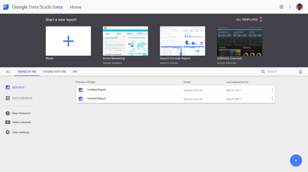
Log into Google Data Studio with you google account.
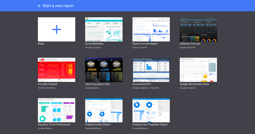
Upon logging in you will see the a series of freely available templates to jumpstart the report creation or you can create your own report from scratch by clicking on the “Start a new report” plus button.
Let’s create our own report from scratch. Click on the big blue plus button.
Name your report. Now we need to import data from Facebook that will act as the data source for our charts and tables. Since Facebook isn’t a Google Product we need to utlise a connector that will allow us to connect and import our Facebook data into Data Studio. There are two ways to do that. Either utilising a Google Sheets connector or, the second option, utilising a third party connector. In this tutorial we will be focusing on the Google Sheets connector.
Import data from Facebook with Google Sheets connector
For this phase, you need to import a Google Sheet with all the Facebook campaigns data you want in your report. Head over to Ads Manager and export your campaigns in a excel format and upload it to your Google Drive. Once you are done, head over to Google Data Studio and click on the “Create a new Data Source button”.
Choose Google Sheets from the left-hand side panel and choose whichever option applies to you depending on whether the file is owned by you, has been shared by you or if it’s stored in a folder in your Google Drive space.
Choose the file, specify the spreadsheet with all the data, and choose the options that apply. When done, click on the “Connect” button.
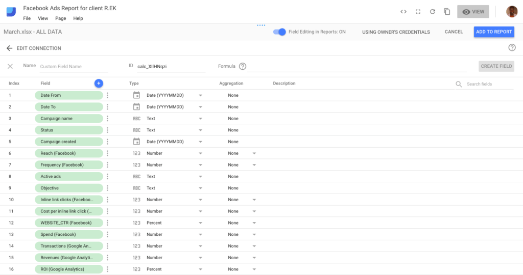
Upon clicking on Connect you can see all the fields you had in your data sheet. Now it would be a good time to:
- Correct the “Type” and “Aggregation” of your data, in the case it is incorrect
- Rename your fields with more descriptive names, if you have not done so in your source file
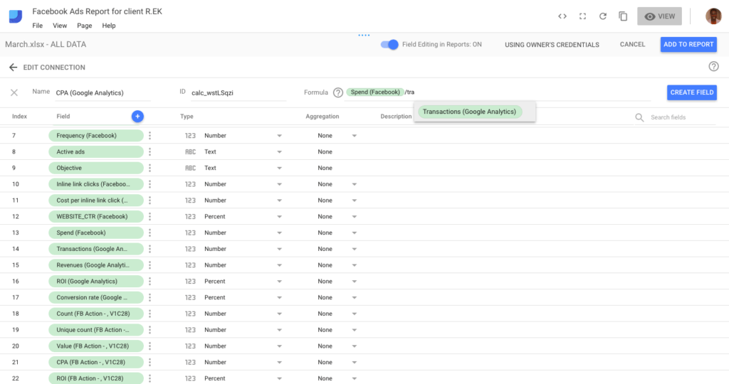
- Create a calculated field, for important metrics that aren’t in your report
- Disable any fields that you don’t plan on using in your report
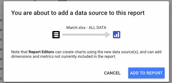
Now that your data source is ready you can add it to your report by clicking on the “Add to Report” button. Your data source has been successfully created and now you can build your report.
Building your report
Prior to creating your report be sure to create a mock-up of how the report will look like and what information goes where, in order to save valuable time. I have adapted one of the templates and I will be using this as a guide for the tutorial.
These are the tools that we’ll be utilising:
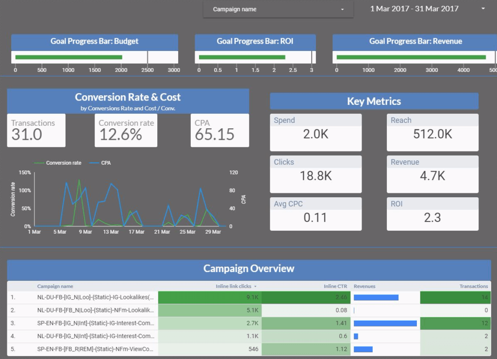
![]() Date Picker: Use the Date Picker tool in order to enable the ability of choosing date ranges to check the campaigns. Be sure to modify this so the offered date range makes sense when examining your campaign’s performance. To do so, click on the the date range element on your report and on the right-side panel click on the tab “data” and select the date range in the “Default Date Range” field. Here, you can choose to customise the date range to either a custom date range (in the case of a limited time campaign) either last seven/fourteen/twenty-eight/thirty days, today, yesterday, last week, and this week.
Date Picker: Use the Date Picker tool in order to enable the ability of choosing date ranges to check the campaigns. Be sure to modify this so the offered date range makes sense when examining your campaign’s performance. To do so, click on the the date range element on your report and on the right-side panel click on the tab “data” and select the date range in the “Default Date Range” field. Here, you can choose to customise the date range to either a custom date range (in the case of a limited time campaign) either last seven/fourteen/twenty-eight/thirty days, today, yesterday, last week, and this week.
![]() Filter Control: Use the Filter Control so that the user can filter through campaigns (or any other report element where filter could be applied such as objective, campaign status etc.). Click on the appropriate button and customise the dimension used on the data tab in the “Dimension” field. This could be ideal for filtering through campaigns, ad sets or different countries/regions you advertise across. When used, the whole report will be filtered based on the chosen campaign.
Filter Control: Use the Filter Control so that the user can filter through campaigns (or any other report element where filter could be applied such as objective, campaign status etc.). Click on the appropriate button and customise the dimension used on the data tab in the “Dimension” field. This could be ideal for filtering through campaigns, ad sets or different countries/regions you advertise across. When used, the whole report will be filtered based on the chosen campaign.
At any time during your report creation, be sure to switch between “View” and “Edit” mode in order to check how your report looks like and if everything works as it’s supposed to.
![]()
Bullet Chart: Moving on to the next section of our report I used the bullet chart option to create a progress bar for your KPIs and secondary goals. Click on the bullet chart and then head over to the Metric Picker and choose spend, ROI and revenue. In the range limits section set up range 1 as the minimum spend/ ROI / Revenue and for range 3 use a value higher than that of each of your KPIs. In the target section enter your target value. This is a visual progress bar that helps you see where you are in achieving your goals.
![]() Rectangle Tool: For separating sections of your report you can use the “Rectangle” tool. Draw a line across your report and make sure to style it as you please.
Rectangle Tool: For separating sections of your report you can use the “Rectangle” tool. Draw a line across your report and make sure to style it as you please.
![]() Time series: You can use this tool to show how a metric has changed over time. This would be ideal for CPA, CPC, spend values, transactions etc. In order to change the type of the diagram you can access the time series properties panel on the right-hand side. Click the “DATA” tab and choose the chart type that will help help you to better illustrate your desired metrics. Move on to the “Dimension” and “Metric” sections and choose date for dimension and Conversion Rate and CPA for the chart’s metrics.
Time series: You can use this tool to show how a metric has changed over time. This would be ideal for CPA, CPC, spend values, transactions etc. In order to change the type of the diagram you can access the time series properties panel on the right-hand side. Click the “DATA” tab and choose the chart type that will help help you to better illustrate your desired metrics. Move on to the “Dimension” and “Metric” sections and choose date for dimension and Conversion Rate and CPA for the chart’s metrics.
![]() Scorecard: For the key metrics section of the report you’ll be utilising the scorecard tool. Choose the metrics you want to appear. On the “STYLE” tab you can check the “Compact Numbers” check box in the case that the numbers are too long and you want them to be readable. In the case that you want to show if there was an increase or decrease for that metric, you should choose any of the “previous period” or “previous year” options in the “Default Date Range” section. Be sure that your data in the source file goes that far in time or else you will be getting a “no data” error.
Scorecard: For the key metrics section of the report you’ll be utilising the scorecard tool. Choose the metrics you want to appear. On the “STYLE” tab you can check the “Compact Numbers” check box in the case that the numbers are too long and you want them to be readable. In the case that you want to show if there was an increase or decrease for that metric, you should choose any of the “previous period” or “previous year” options in the “Default Date Range” section. Be sure that your data in the source file goes that far in time or else you will be getting a “no data” error.
![]()
Table: A table could be great to show breakdowns for dimensions such as campaigns, adsets, ads etc. in order to see which are the best performing ones and which ones you should consider pausing. Click on the table tool and on the “DATA” tab choose Campaign Name as the dimension and choose the metrics you want shown for the campaigns (inline clicks, inline CTR, revenues. and transactions). In order to help with analysis and provide more contest to the data you can format it as heat map. Scroll until you find the “Columns” section and for the desired column of your table, instead of “number” – the default value, choose heatmap or bar/pub (for the revenue column).
And there you have it! Your report is now ready to be share with your client, team or colleagues. You can do so by clicking on the “Share this report” icon.
Limitations of Google Data Studio
Although Google Data Studio is a great tool, it does have some limitations.
- Cannot have more than one data sources in one chart. In the case that you wanted more than one sources, it is not an option at the moment.
- Can only be view online and cannot be downloaded.
- When importing data from an excel file you can only choose one sheet at the time.
Despite the above-mentioned limitations Google Data Studio is a free tool that takes your campaign reporting to a new level.